
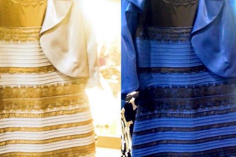
Color in light is a complex subject. There are super smart color scientists developing metrics to tell us why two luminaires that list the same 3000K color temperature aren’t the same color at all. If we put the two fixtures side by side the vast majority of people could probably see the slight differences in the color.
Color Space
The color of light is defined by a [temperature] scale developed by William Thomson, a British mathematical physicist, in the mid-19th century. Thomson’s work centered on thermodynamics defining the correct value of absolute zero at -273.15 degrees Celsius. For this and many other accomplishments, Thomson was knighted and also became the 1stBaron Kelvin, a title that comes from the River Kelvin that flowed near his laboratory at the University of Glasgow. Absolute temperatures are stated in units of kelvin (K) in his honor.
In 1931 International Commission on Illumination (CIE) developed what we now commonly refer to as the RBG (red, blue, and green tristimulus values) and XY color space, still widely used today. When we superimpose the black body curve onto this color space, we can see the various colors of “white” light. The perception of white is relative to the relationship of red, blue, and green in the source. The entire diagram is the gamut of the human visual system’s ability to see the visible light spectrum.
The simple explanation of the black body curve is based on heating a piece of iron. As the temperature increases, the iron becomes red, bright red, orange, yellow, white, and eventually blue-white. In fact, the color of light isn’t actually 3000K. If it were, we would burn ourselves, so the color temperature scale we use today is a correlated number based upon what the color the iron would look when heated. Stars range from 800K to 12,200K and we know that the color of daylight changes over the course of a day from the warm colors of sunrise to noon to the evening sunset. The color the human visual system perceives as white light is not constant.
White LEDs
We also know there is no such thing as a white LED. White light is created either by using an ultraviolet or blue LED with a yellow phosphor coating or mixing red, blue, and green. Mixing pure red, blue, and green does produce white light, but it is generally not a very good white. Humans do not perceive the colors in equal proportions so the white from an RGB mix is generally skewed with a slight green tint. For the sake of this discussion, let’s focus on the white produced by the yellow phosphor coating.
Each manufacturer’s formula for the coating may be slightly different which is how we get two luminaires both listing a 3000K color that is not exactly the same. One might be 3000 plus a little and the other 3000 minus a little. If the first luminaire is just above the black body curve, it will look slightly more yellow while below the curve will be slightly pink. Some get lucky and land right on the curve, but compared side by side, few of them will look the same.
Color Metrics
To add insult to injury, the lighting industry has commonly used another metric called Color Rendering Index to explain how natural a given source will make colors appear. This metric, although still used today, is flawed since it averages 8 pastel colors to assign a value somewhere between 0 and 100. The problem starts with the fact that somewhere in the math, the [blue deficient] incandescent lamp was given a value of 100 and nothing can quite match it when, in fact, there are many examples of other sources that more accurately represent colors than does the incandescent lamp. Sorry, Edison.
We did figure out that fluorescent lamps weren’t very good at rendering color without adding expensive phosphors and LEDs have the same affliction, driven by the efficacy of the blue LED source. When red phosphor was increased to make the color better, the efficiency of the LED package is reduced, which is why many LED manufacturers promoted high color temperatures. Marketing triumphs over visual preference again.
The Color Rendering Index was convenient because it gave us one number to reference, but did it really? We needed to know the color temperature as well as the color rendering index, so we are using two separate metrics anyway.
To address the variances, some really smart people with the Color Committee and Color Metric Task Group at the Illuminating Engineering Society developed a new metric that is detailed in a Technical Memorandum called TM-30, published by the IESNA (www.iesna.org). They developed a much more discreet system by measuring the Fidelity (Rf) and the Gamut (Rg) of a source compared to a reference source. However, since few manufacturers publish the Rf and Rg values, it is like looking at a photo of a beach instead of being at the beach—a glimpse of the fun you aren’t having.
Looking Forward
Better information would be to publish the Spectral Power Distribution of each luminaire so a designer would know exactly what the color is such as 3245K or 3185K and the x,y coordinates on the color space would tell you exactly where that color is compared to the black body curve. At least one would know if it is on, above, or below the line and be able to assess the color. Another option is to get a sample of every luminaire specified on a project to compare. Admirable objective, but lacks some practicality. One can only hope with the advancement of knowledge manufacturers are willing to share the information they have to help designers more accurately understand what Lord Kelvin was trying to tell us.